The Design System Playbook
Design systems are more than UI libraries—they establish the foundations, documentation, governance, and collaboration that enable teams to design and build consistently at scale.


Planning & Audit
Evaluate the product ecosystem, identify reusable opportunities, align business and technical requirements, and establish a strategic foundation for a scalable design system.

Foundations
Define the core visual and interaction principles—including color, typography, spacing, layout, motion, and accessibility—to establish a consistent and scalable design language.
Design Tokens & Figma Variables
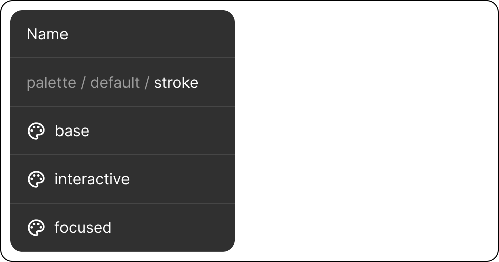
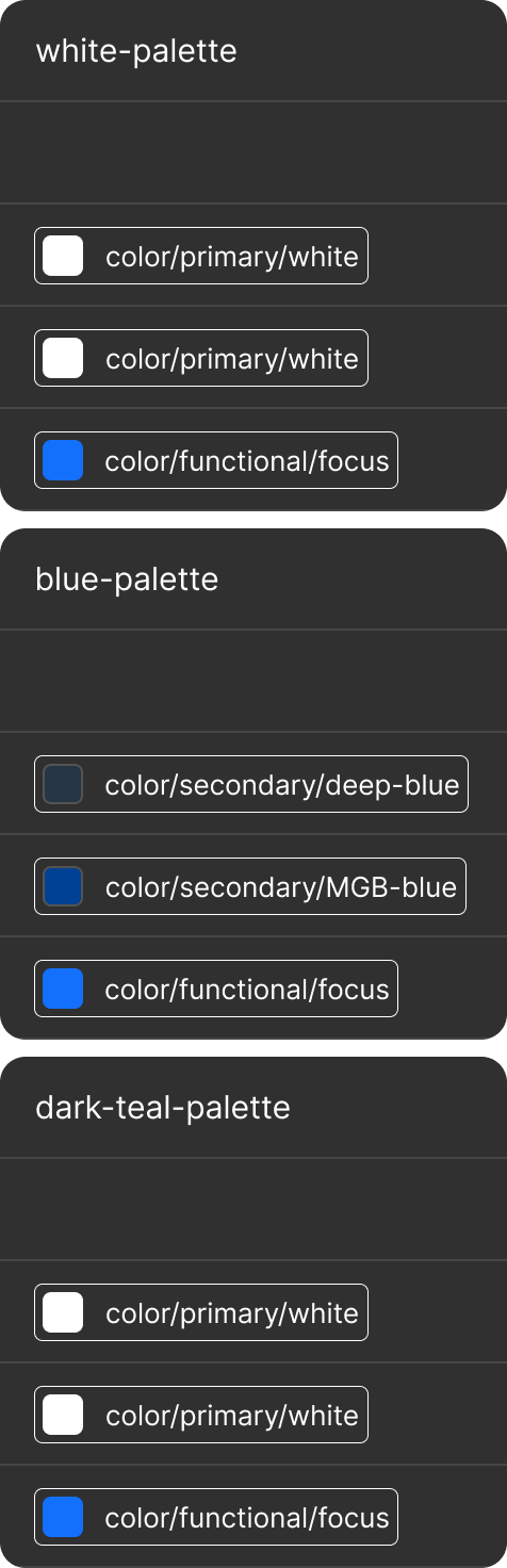
Standardize colors, typography, spacing, and other design decisions through tokens and Figma variables to improve consistency and design-to-code alignment.
Component Architecture
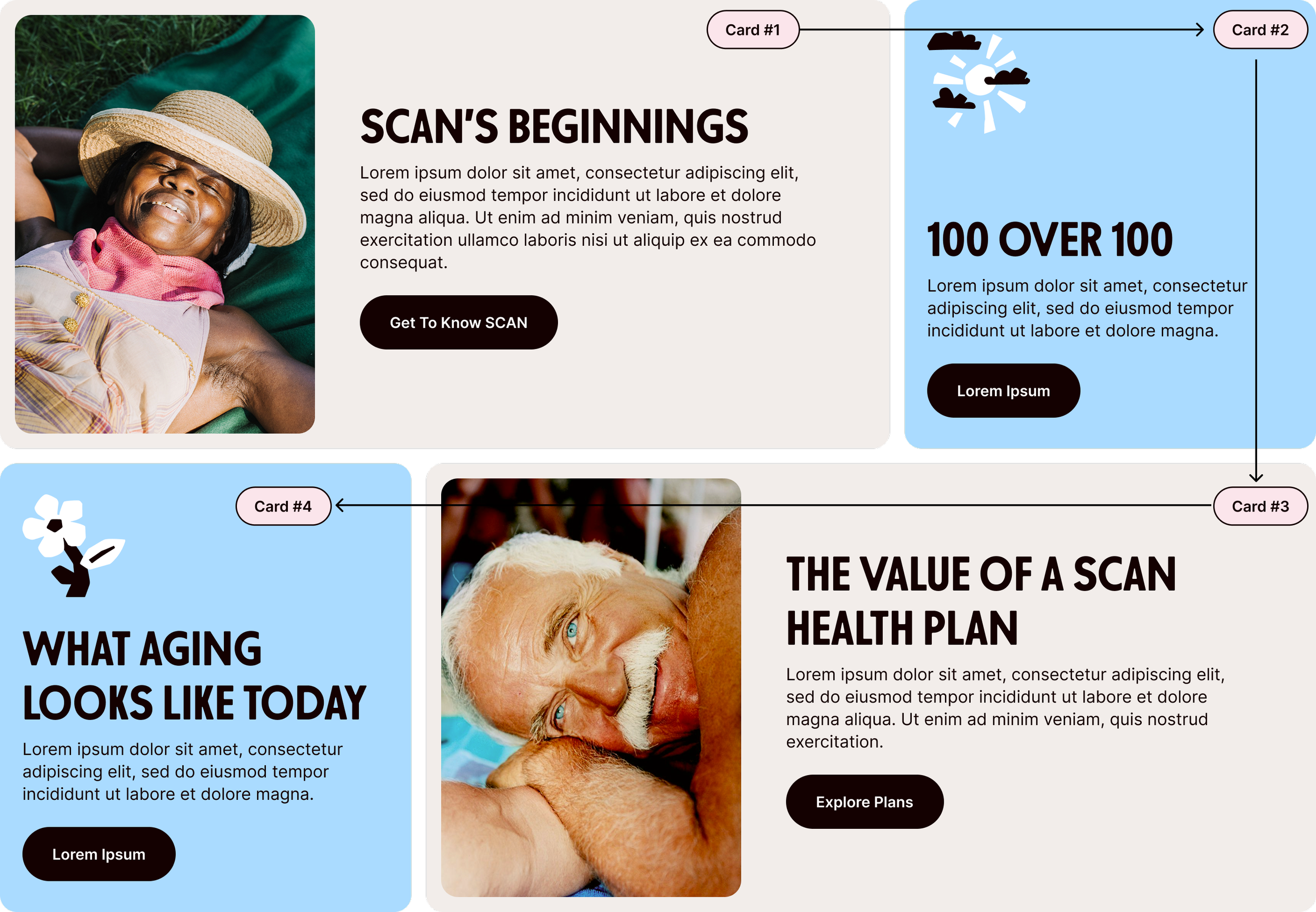
Build scalable, reusable component libraries with clear hierarchy, consistent patterns, and flexible properties that support efficient product development.
Checklist
Core Components
Composite Components
Variants
Component Properties
Interactive Components
Responsive Behavior
Templates
Documentation
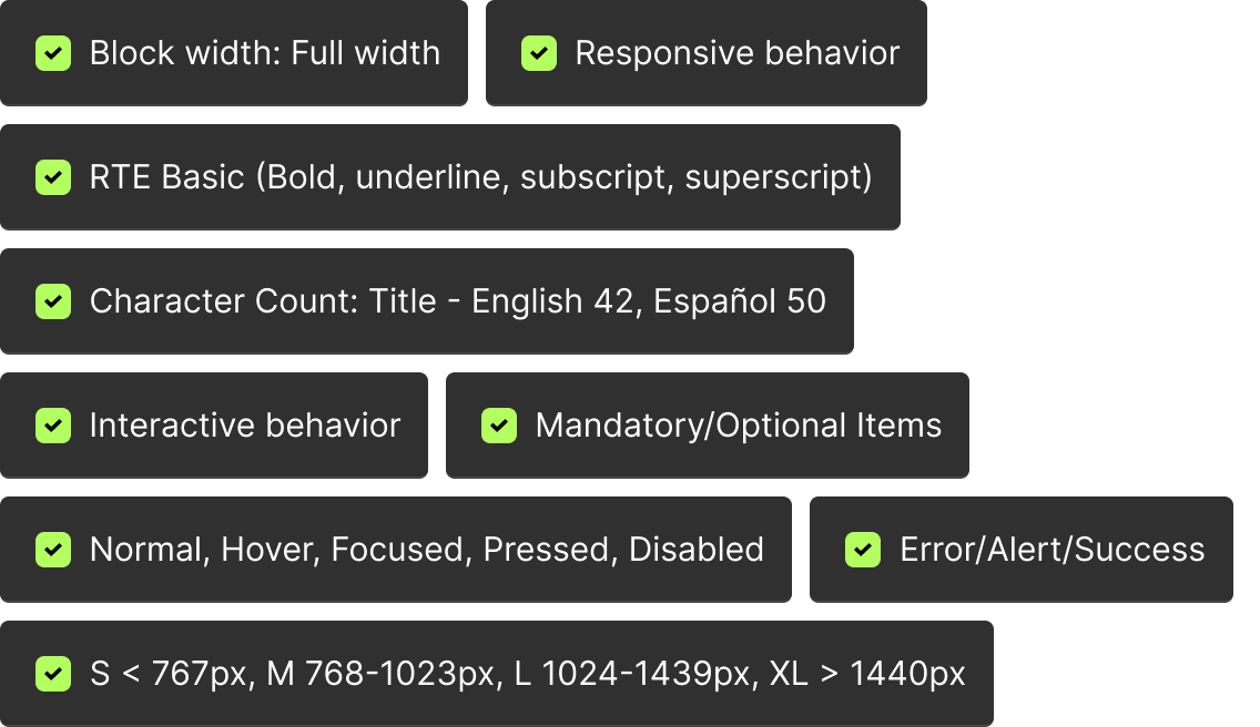
Document component usage, behaviors, accessibility requirements, and design specifications to ensure consistent implementation across products.
Block Widths
Full width (ex: Site Section)
Column Width (ex: Article Detail)
Side Panel Width (ex: Section Navigation)
Responsive behaviour
Mobile and Desktop Designs
Breakpoints - Desktop to Mobile
Any Hover or Pressed States - with labels
Character count
max. text count for English and non-English
Validate and maintain inclusive experiences through accessibility standards, usability testing, and quality assurance across the design system.
Checklist
WCAG 2.2 AA Review
Color Contrast Testing
Keyboard Navigation
Screen Reader Testing
Focus State Validation
Component QA
Accessibility & Quality Assurance

Bridge design and engineering through shared systems, clear specifications, and collaborative workflows that ensure accurate, scalable, and maintainable implementation.
Checklist
Design & Development Alignment
Shared Component Libraries
Token Synchronization
Component Specifications
Developer Handoff
Technical Feasibility Review
Design QA
Implementation Validation
Design-to-Code Collaboration


Continuous Improvement
Continuously evolve the design system through feedback, usage insights, and collaboration to improve scalability, efficiency, and product experiences over time.